

Shared Settings
Edit settings for the overall game UI.
[Select UI Pattern]
Select a UI pattern. In RPG Maker Unite, you can choose between 3 types.

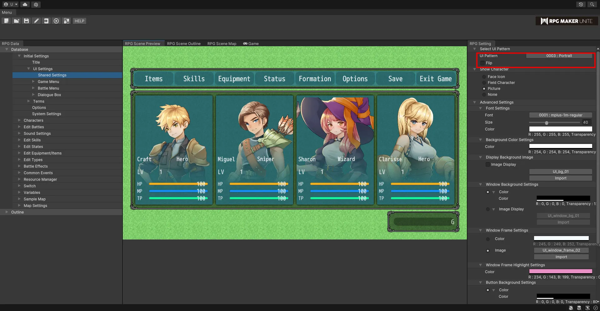
| UI Pattern | Select a UI pattern. |
| Flip Horizontally | Horizontally flip the currently selected UI pattern. |
[Show Character]
Set how character images are displayed. If none of the options listed below are chosen, no images will be shown for characters.

| Face Icon | Face icons will be displayed for character images. If a face icon isn't set for an actor, nothing will be shown. |
| Field Character | Field characters will be displayed for character images. |
| Picture | Pictures will be displayed for character images. If a picture isn't set for an actor, nothing will be shown. |
[Advanced Settings]
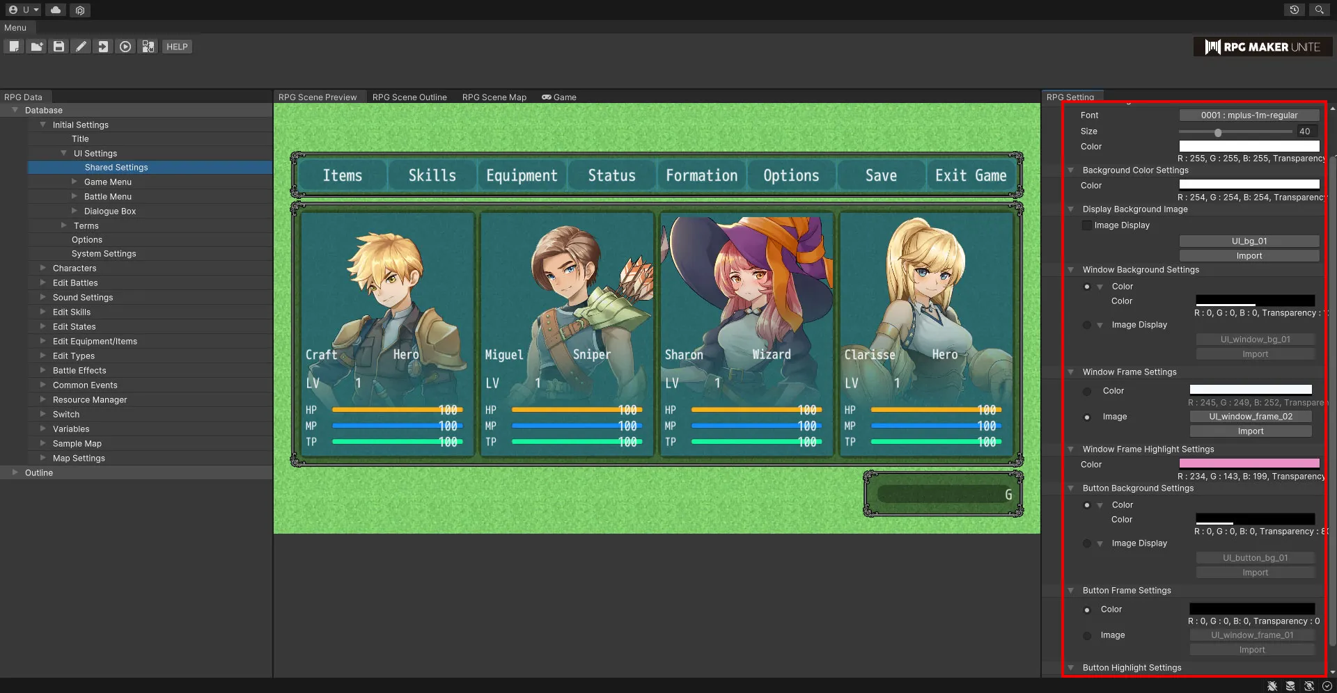
Font Settings
Set the font used by the UI.
| Font | Select the font. |
| Size | Set the size of the text. This value can range from 10 to 100px. |
| Color | Use the color picker to set the color of the text. |
| Offset | Set the position of the text using the X and Y coordinates. |
Background Color Settings
Set the color of the background behind the UI window.
| Color | Use the color picker to set the color. |
Background Image Settings
Set an image to display behind the UI window.
| Image Display | Check this box to display the image. |
| Select Image | Select an image. |
| Import | If you wish to use an image from outside RPG Maker Unite, you can select a file and import it. |
| Size | Set the size of the background image. This value can range from 1% to 200%. |
| Position | Set the position of the menu window using the X and Y coordinates. |
Window Background Settings
Edit settings for the background of each window.
| Color | Check this box to be able to change the background color of the UI windows. Use the color picker to set the color. |
| Image Display | Check this box to be able to display an image for the background of the UI windows. |
| Select Image | Select an image. |
| Import | If you wish to use an image from outside RPG Maker Unite, you can select a file and import it. |
| Size | Set the size of the background image. This value can range from 1% to 200%. |
| How to Create a Window Background | Window backgrounds have a resolution of 96x96 pixels and are divided into 9 sections when displayed. Use the sample images as a reference to try and make your own. |
Window Frame Settings
Edit settings for the frames around each window.
| Color | Check this box to be able to change the color of the UI window frames. Use the color picker to set the color. |
| Image display | Check this box to be able to display an image for the frame of the UI windows. |
| Image Selection | Select an image. |
| Import | If you wish to use an image from outside RPG Maker Unite, you can select a file and import it. |
| How to create a window frame | The window background is a 192 x 192 pixel image divided into 9 sections. Please refer to the sample image for creation. |
Window Frame Highlight Settings
Edit settings for the highlights of the selected window frame.
| Color | Use the color picker to set the color of the text. |
Button Background Settings
| Color | Check this box to be able to change the background color of the buttons. Use the color picker to set the color. |
| Image Display | Check this box to be able to display an image for the background of the buttons. |
| Select Image | Select an image. |
| Import | If you wish to use an image from outside RPG Maker Unite, you can select a file and import it. |
| Size | Set the size of the button background image. This value can range from 1% to 200%. |
| How to Create a Button Background | Button backgrounds have a resolution of 96x96 pixels and are divided into 9 sections when displayed. Use the sample images as a reference to try and make your own. |
Button Frame Settings
| Color | Check this box to be able to change the color of the button frames. Use the color picker to set the color. |
| Image display | Check this box to be able to display an image for the frame of the buttons. |
| Image Selection | Select an image. |
| Import | If you wish to use an image from outside RPG Maker Unite, you can select a file and import it. |
| How to create a button frame | Button frames have a resolution of 192x192 pixels and are divided into 9 sections when displayed. Use the sample images as a reference to try and make your own. |
Button Highlight Settings
Edit settings for the highlights of the selected button.
| Color | Use the color picker to set the color of the text. |
Game Menu
You can see visualizations of the UI for each game menu with the settings from Shared Settings in effect. Furthermore, you can also set the menu items that appear in the main and item menus.
[Main]
See a visualization of the main menu UI.
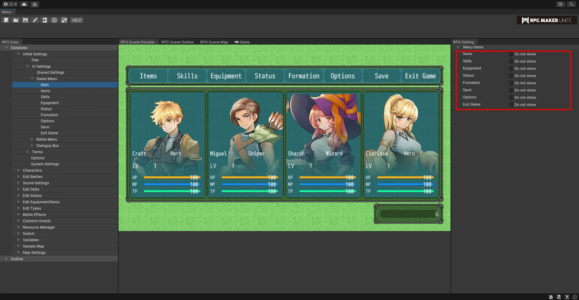
Menu Items
Checking a box will remove that option from the main menu and prevent it from being selectable in-game. For example, this can allow you to create a game where the player cannot save.
| Items | Check this box to remove this from the main menu. |
| Skills | Check this box to remove this from the main menu. |
| Equipment | Check this box to remove this from the main menu. |
| Status | Check this box to remove this from the main menu. |
| Formation | Check this box to remove this from the main menu. |
| Save | Check this box to remove this from the main menu. |
| Options | Check this box to remove this from the main menu. |
| Exit Game | Check this box to remove this from the main menu. |
[Items]
See a visualization of the item UI.
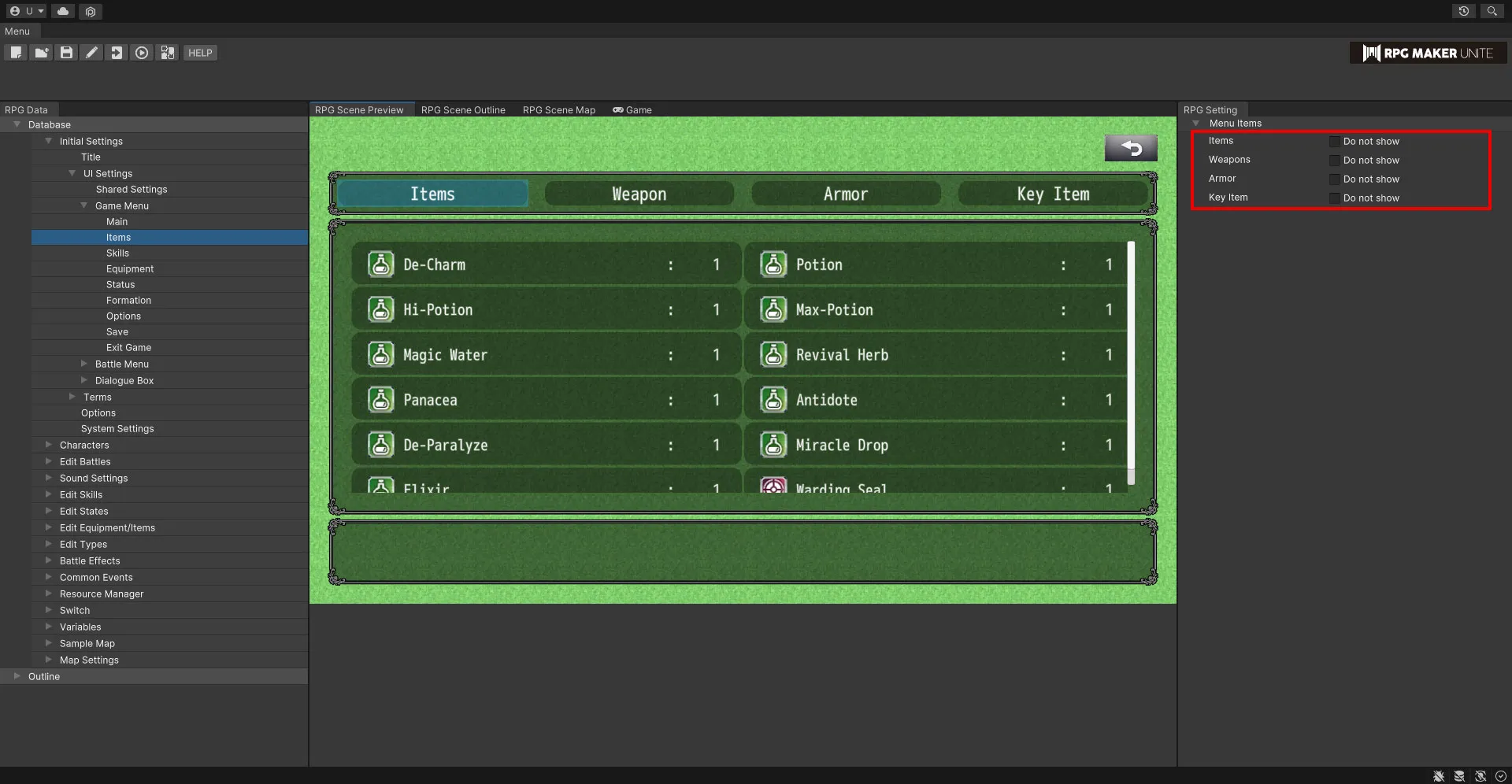
Menu Items
Checking a box will remove that option from the item menu and prevent it from being selectable in-game. For example, this can allow you to create a game where the player cannot see their key items.
| Items | Check this box to remove this from the item menu. |
| Weapons | Check this box to remove this from the item menu. |
| Armor | Check this box to remove this from the item menu. |
| Key Items | Check this box to remove this from the item menu. |
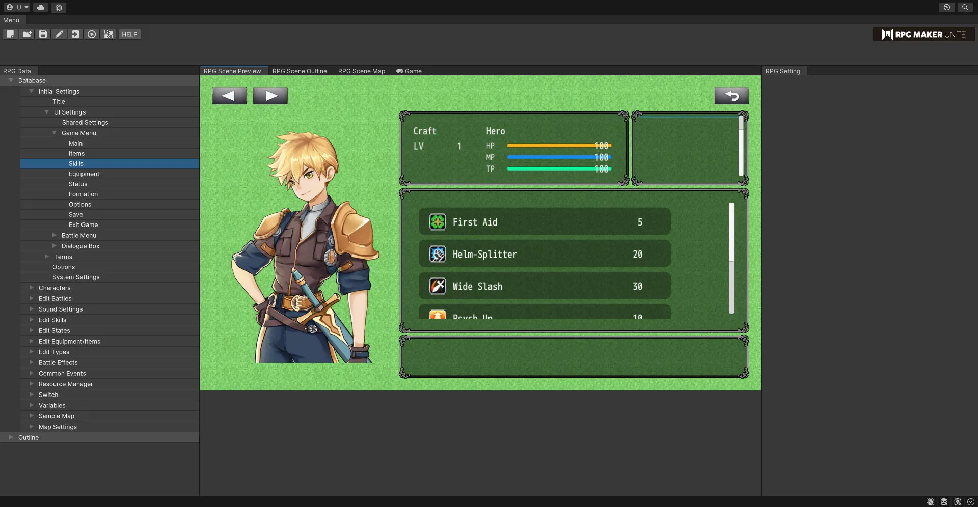
[Skills] See a visualization of the skills UI.
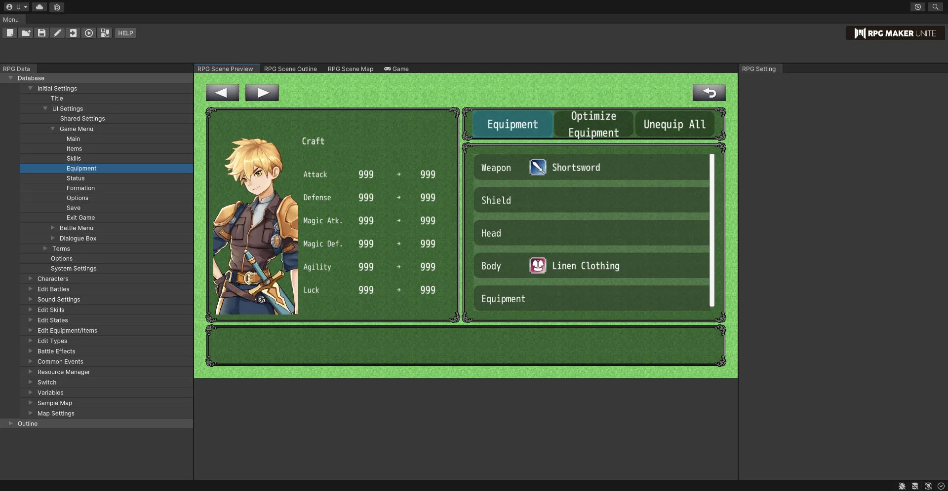
[Equipment] See a visualization of the equipment UI.
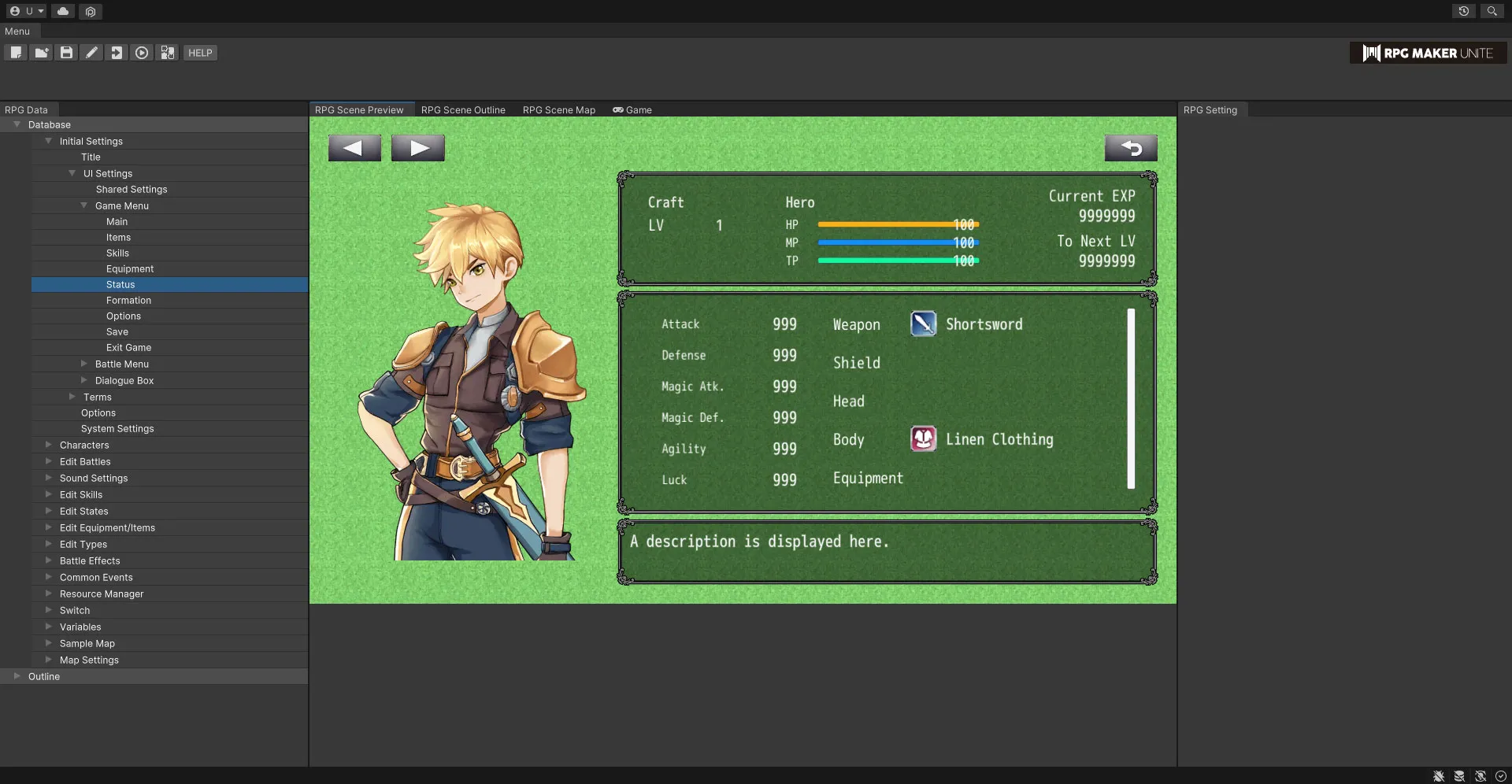
[Status] See a visualization of the status UI.
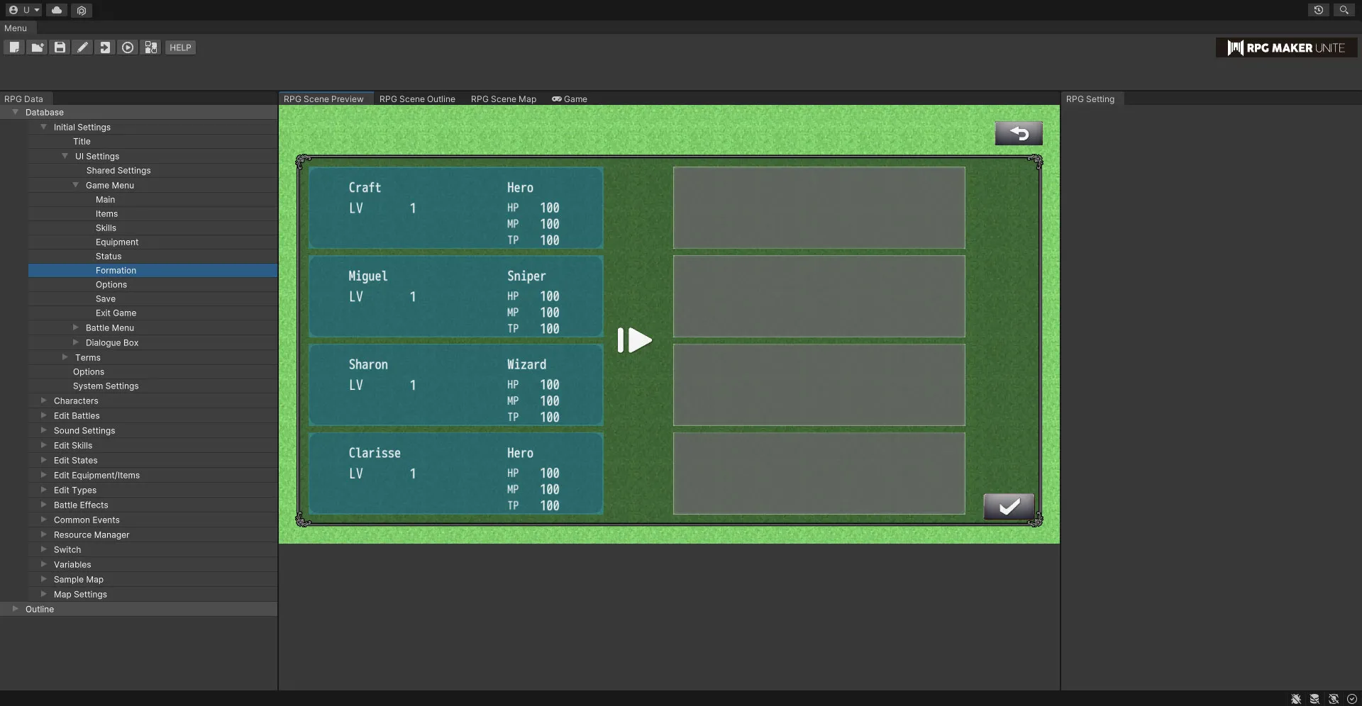
[Formation] See a visualization of the formation UI.
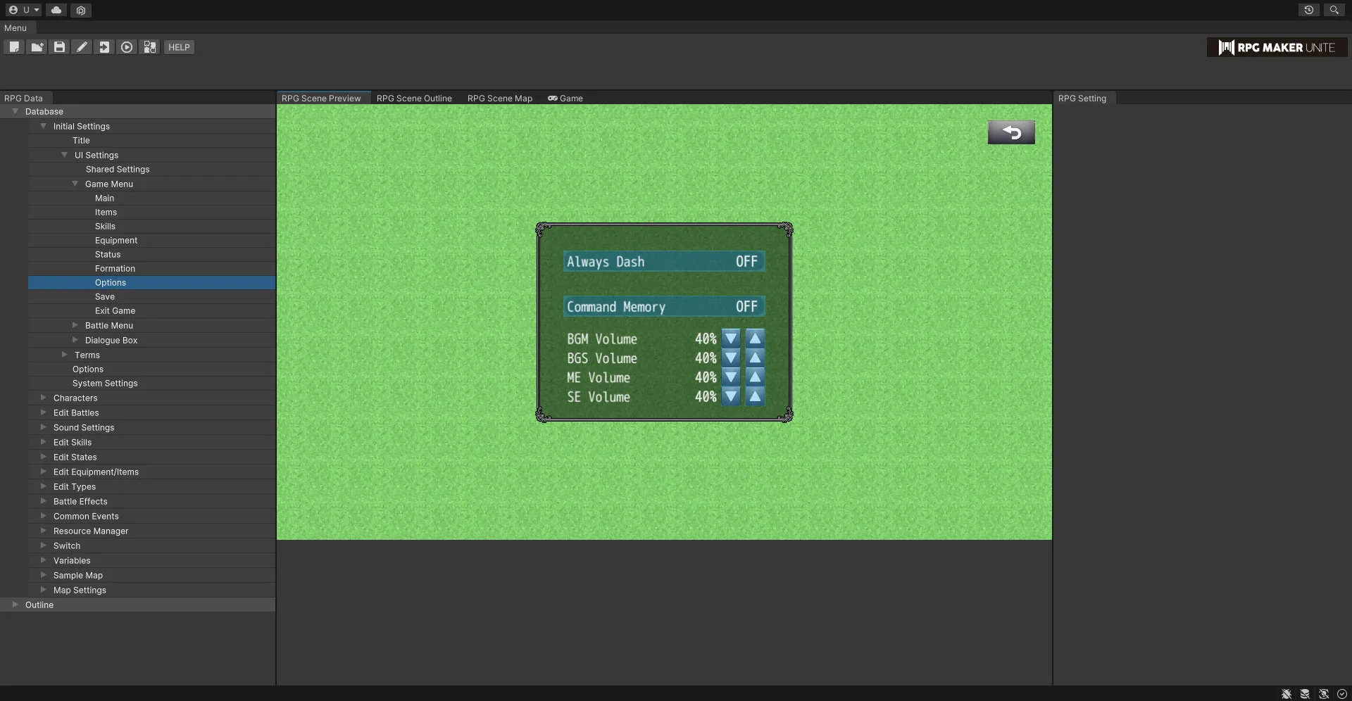
[Options] See a visualization of the options UI.
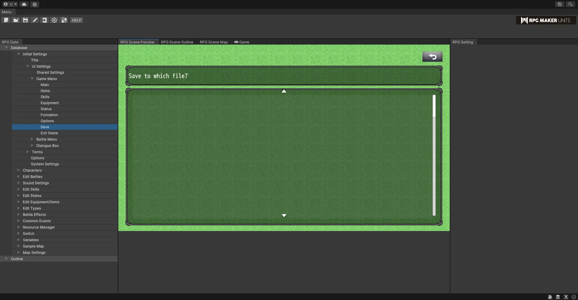
[Save] See a visualization of the save UI.
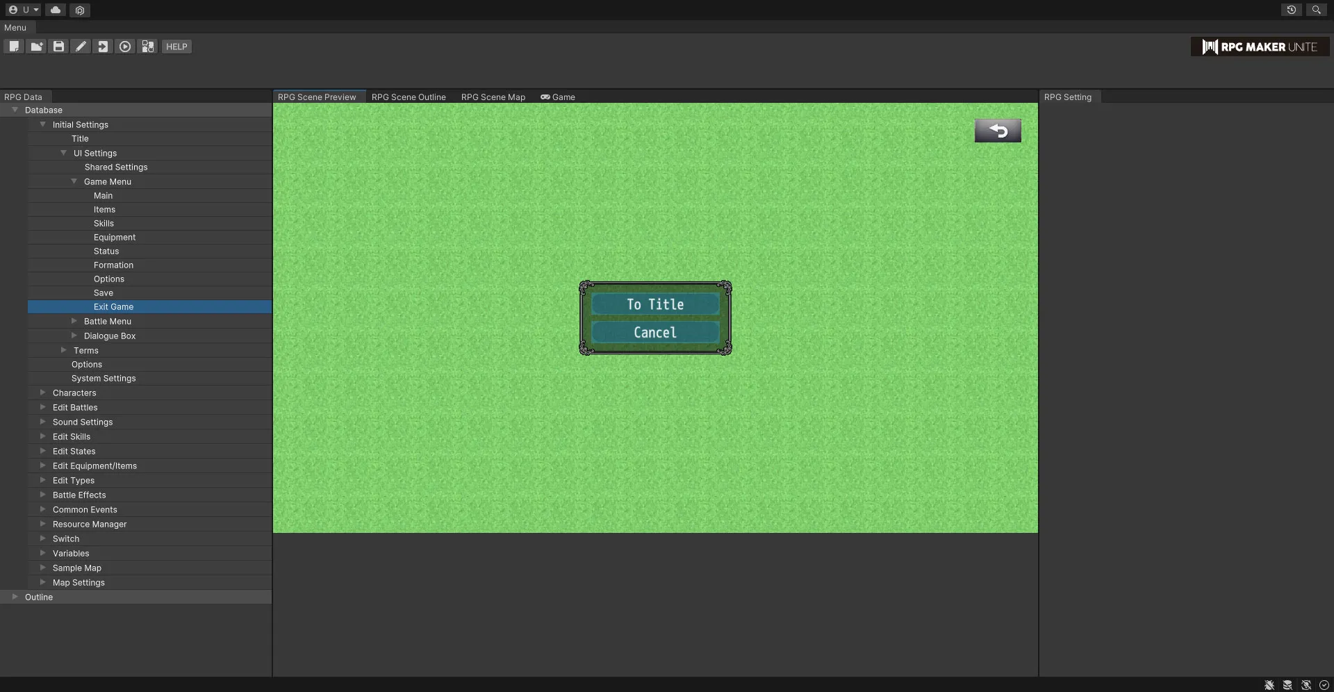
[Exit Game] See a visualization of the exit game UI.
Battle Menu
You can see a visualization of the UI for the battle menu with the settings from Shared Settings in effect. Furthermore, you can also set the menu items that appear.
[Main]
See a visualization of the in-battle UI.
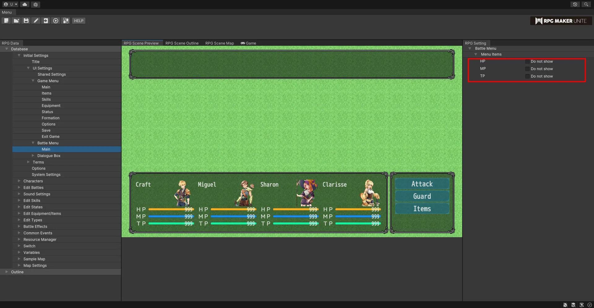
Menu Items
Checking a box will remove that option from the battle menu and prevent it from being selectable in-game. For example, this can allow you to create a game that doesn't use TP.
| HP | Check this box to remove this from the battle menu. |
| MP | Check this box to remove this from the battle menu. |
| TP | Check this box to remove this from the battle menu. |
Dialogue Box
Edit settings for dialogue boxes and see visualizations of what they look like.
[Character Display]
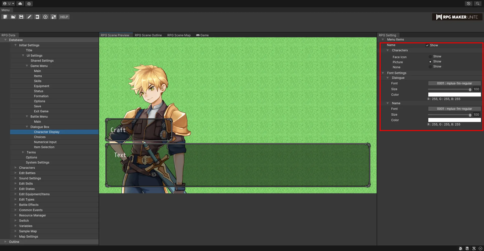
Menu Items
Set the character information that is displayed in dialogue boxes.
| Name | Check this box to display character names. |
| Characters | Check one of these boxes to be able to display character images in "Message/Show Text" event commands. Choose between "Face Icon", "Picture", and "Field Character". If the character does not have a face icon, picture, or field character set in the Master Character List, it will not be displayed even if the box is checked. |
Face Icon Picture None
Font Settings
Dialogue
Set the font used for dialogue.
| Font | Select the font. |
| Size | Set the size of the text. This value can range from 10 to 100px. |
| Color | Use the color picker to set the color of the text. |
Name
Set the font used for names.
| Font | Select the font. |
| Size | Set the size of the text. This value can range from 10 to 100px. |
| Color | Use the color picker to set the color of the text. |
[Choices]
Set the font used for choices. The position can be set from the "Message/Choices" event command.
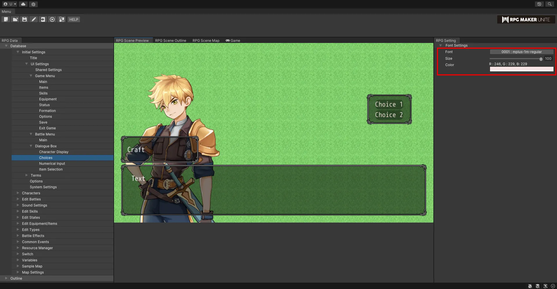
Font Settings
| Font | Select the font. |
| Size | Set the size of the text. This value can range from 10 to 100px. |
| Color | Use the color picker to set the color of the text. |
[Numerical Input]
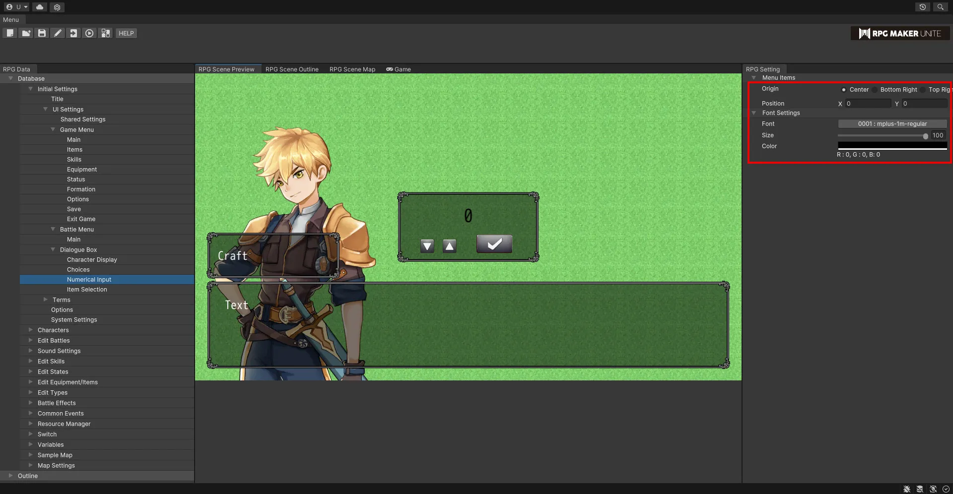
Position
Edit settings for numerical input windows.
| Origin | Set the origin that will be used when deciding the position of a numerical input window. Choose between "Center", "Bottom Right", "Top Right", "Bottom Left", and "Top Left". |
| Position | Set using the X and Y coordinates. |
Font Settings
| Font | Select the font. |
| Size | Set the size of the text. This value can range from 10 to 100px. |
| Color | Use the color picker to set the color of the text. |
[Item Selection]
Edit settings for item selection windows.
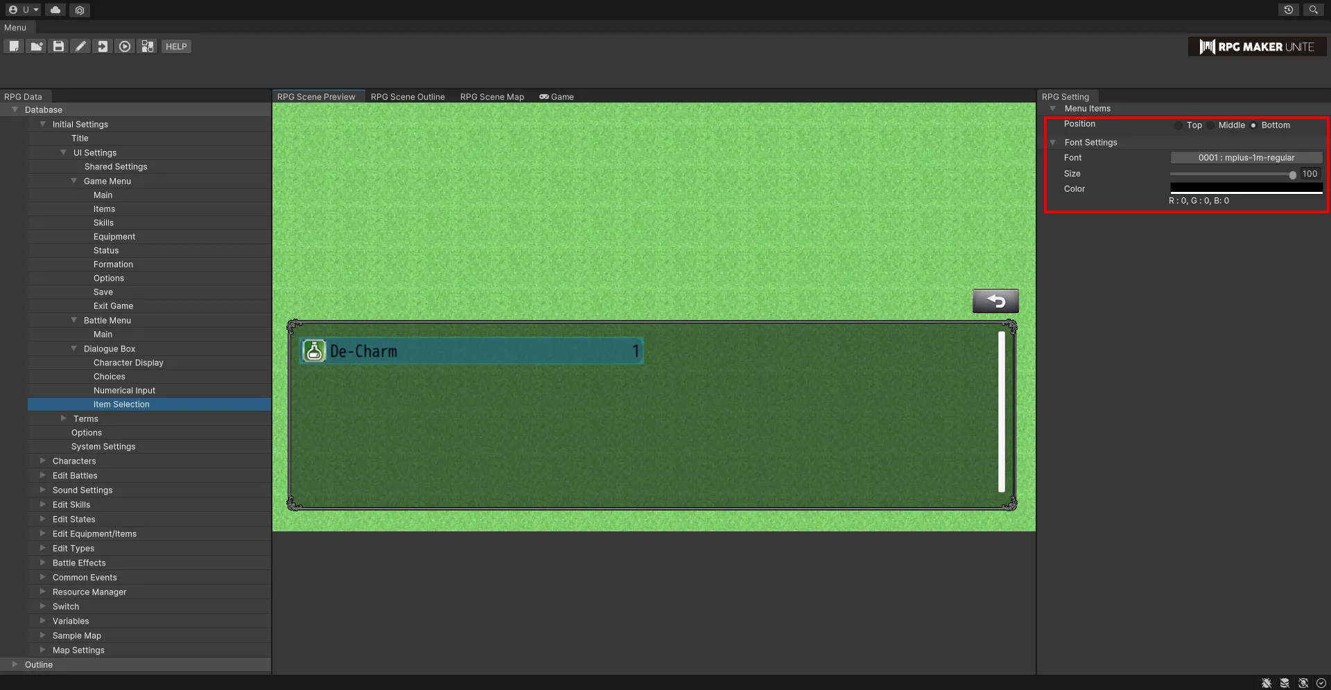
Position
| Position | Choose between "Top", "Middle", and "Bottom". |
Font Settings
| Font | Select the font. |
| Size | Set the size of the text. This value can range from 10 to 100px. |
| Color | Use the color picker to set the color of the text. |